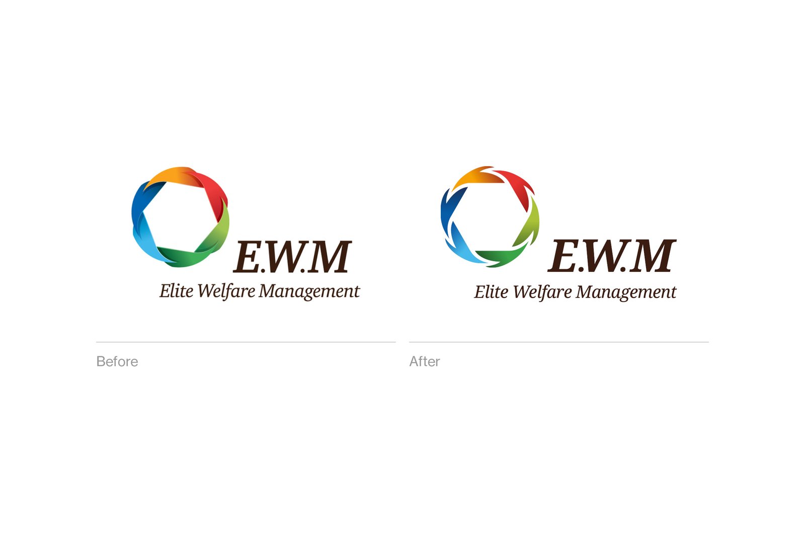
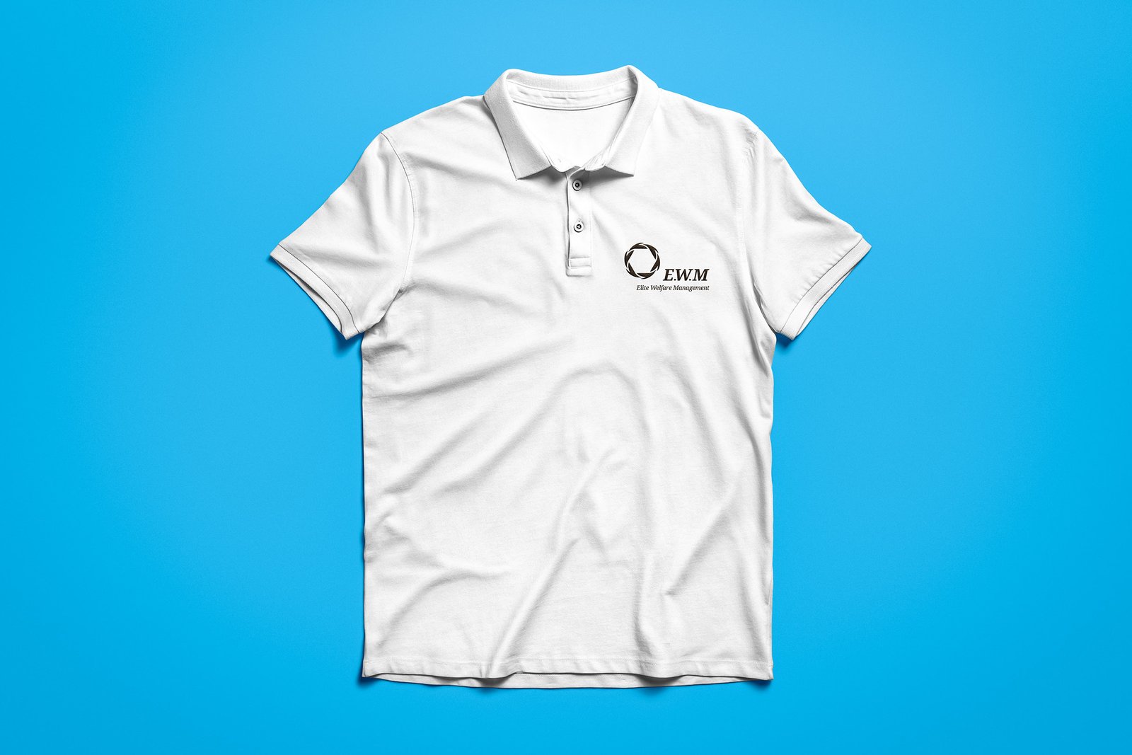
To make the logo work when printed in one colour, I added some space between each of the coloured segments in the logomark. This, along with setting the company name in a slightly bolder typeface, was enough to give it the more modern feel it needed. For the finishing touch, I rotated the logomark so that the hexagon shape formed in the negative space sat straight rather than at an angle.
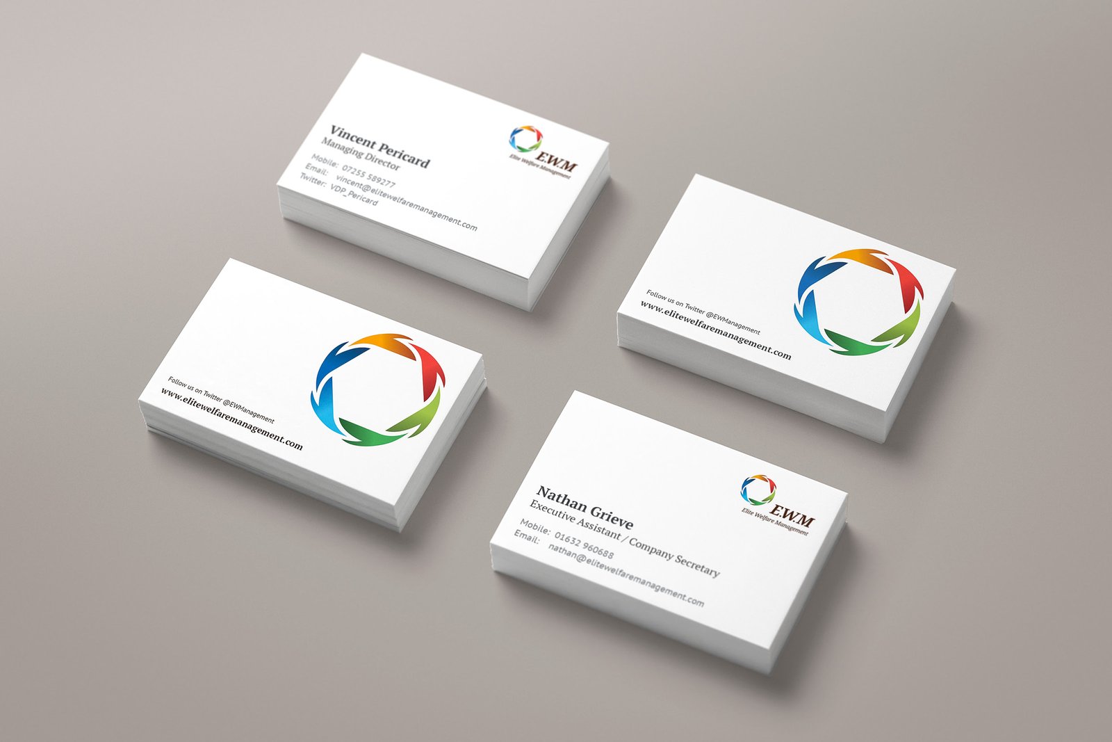
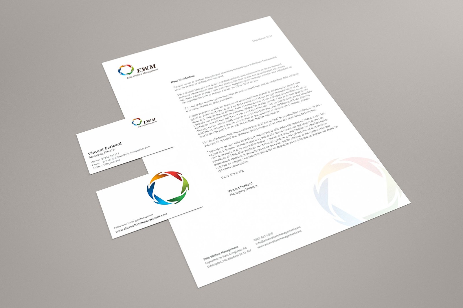
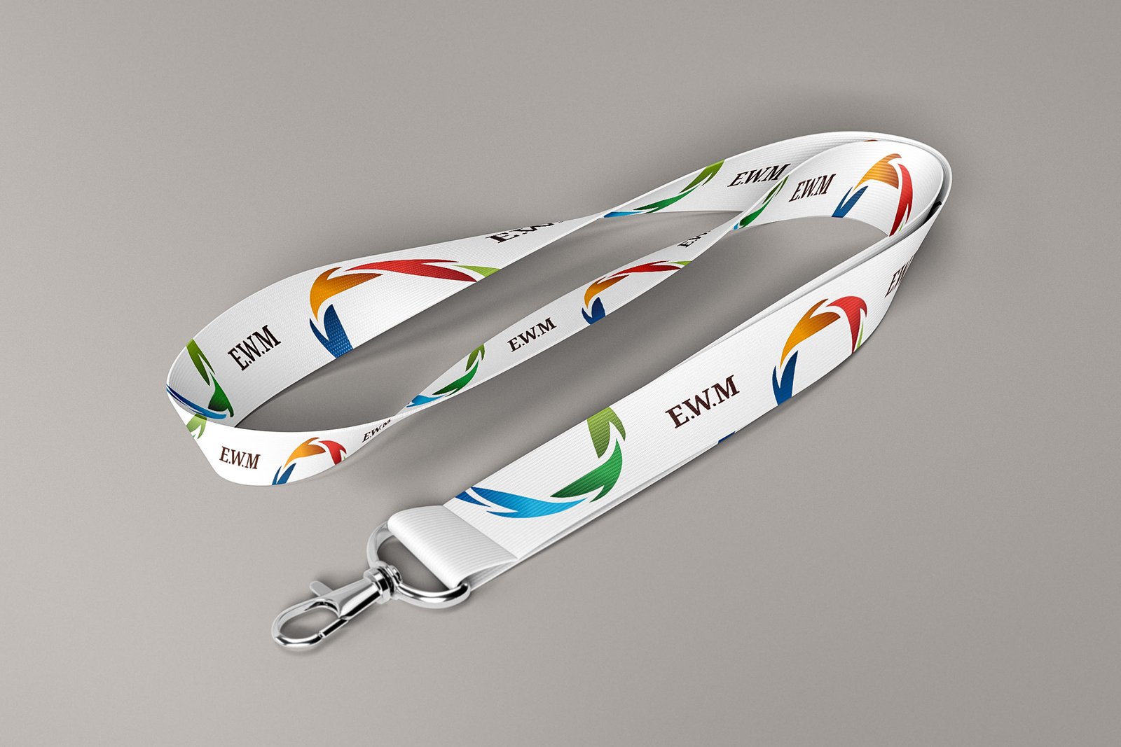
After the logo was finalised, I redesigned the brand’s business stationery and updated the all their design files that featured the old logo.
Client feedback
“Sam’s services have played a key role in the development of EWM. He has never let us down, even on a tight schedule he always delivers and maintains the high standard required. His reliability and creativity are second to none. I would highly recommend him if you need someone that will deliver a high standard of work time and time again.”
Vincent Pericard
Founder, Elite Welfare Management
