Select Page

Kiva's logo design

Kiva's logo design

About the project

Kiva’s is a Canada-based bakery that has a contemporary take on traditional baking, making all of its food from scratch, using wholesome natural ingredients and no chemicals, conditioners or preservatives.

Having been in business for over 40 years, Kiva’s felt it was time for a new logo. They wanted something modern but with a retro feel, that would appeal to their target audience of 20-40 somethings.

Deliverables

  • Logo design
▪ ▪ ▪
Kiva's logo design

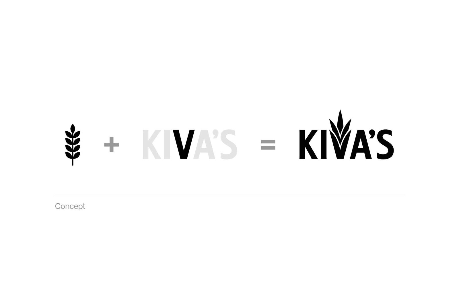
I created the logo using a typeface called Collegiate, which out of the box is slightly more retro than it is modern. However, by making a couple of tweaks to the letter ‘A’, I was able to achieve the right balance and create a wordmark that looks as fresh today as it would have done in the 1970s.

I then went a step further, altering the letter ‘V’ to form a symbol resembling the shape of wheat. The result is a distinctive logo with mass appeal that perfectly reflects Kiva’s contemporary take on tradition.

Kiva's logo design concept
Kiva's signage mockup
Kiva's apron mockup
Kiva's packaging mockup