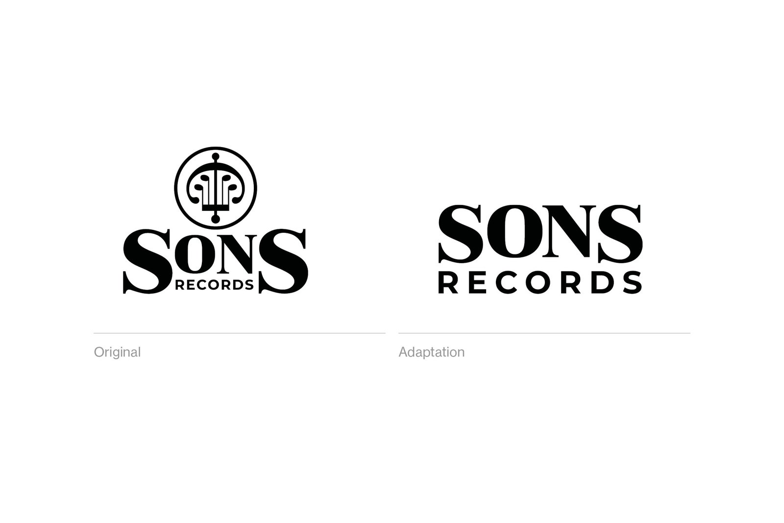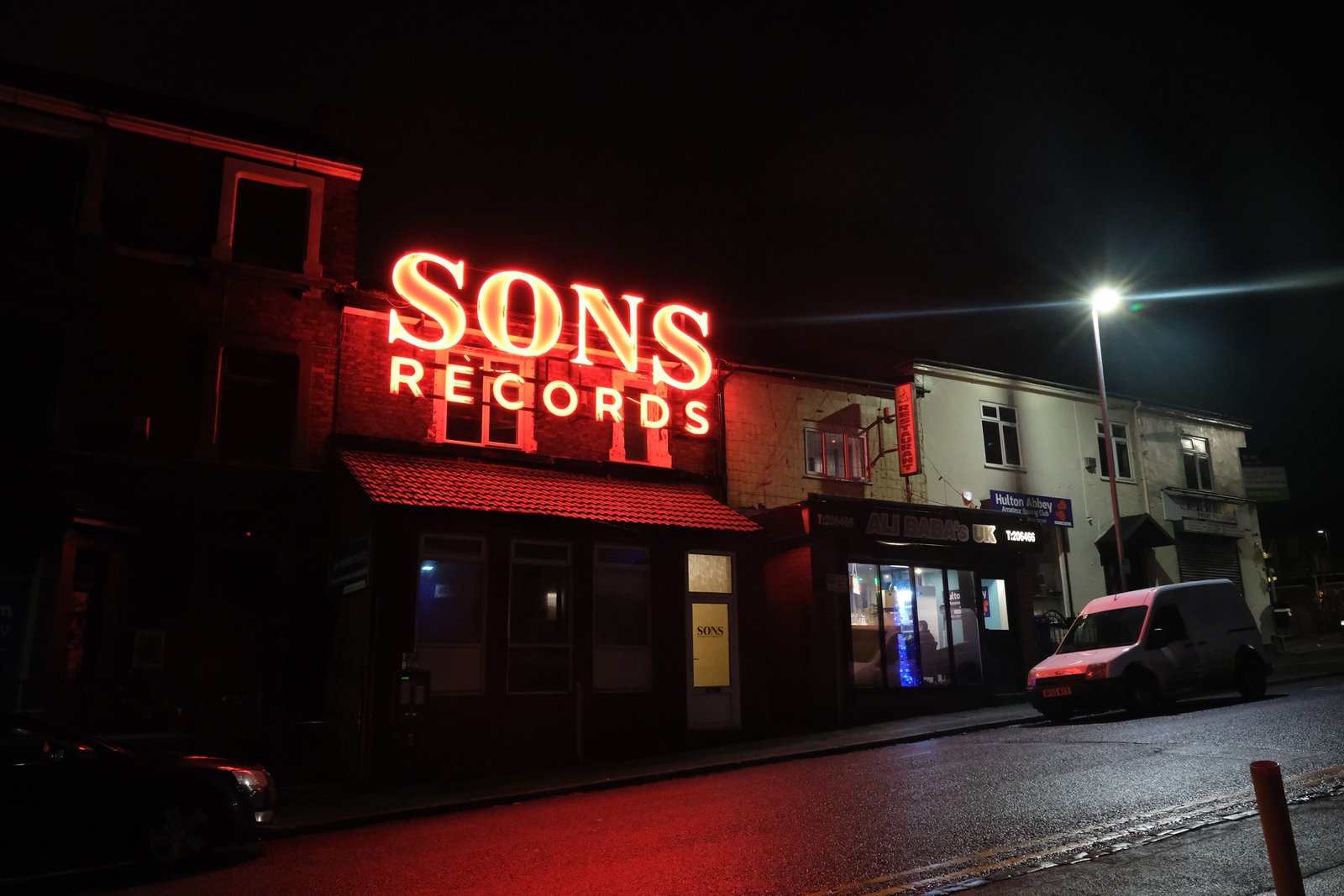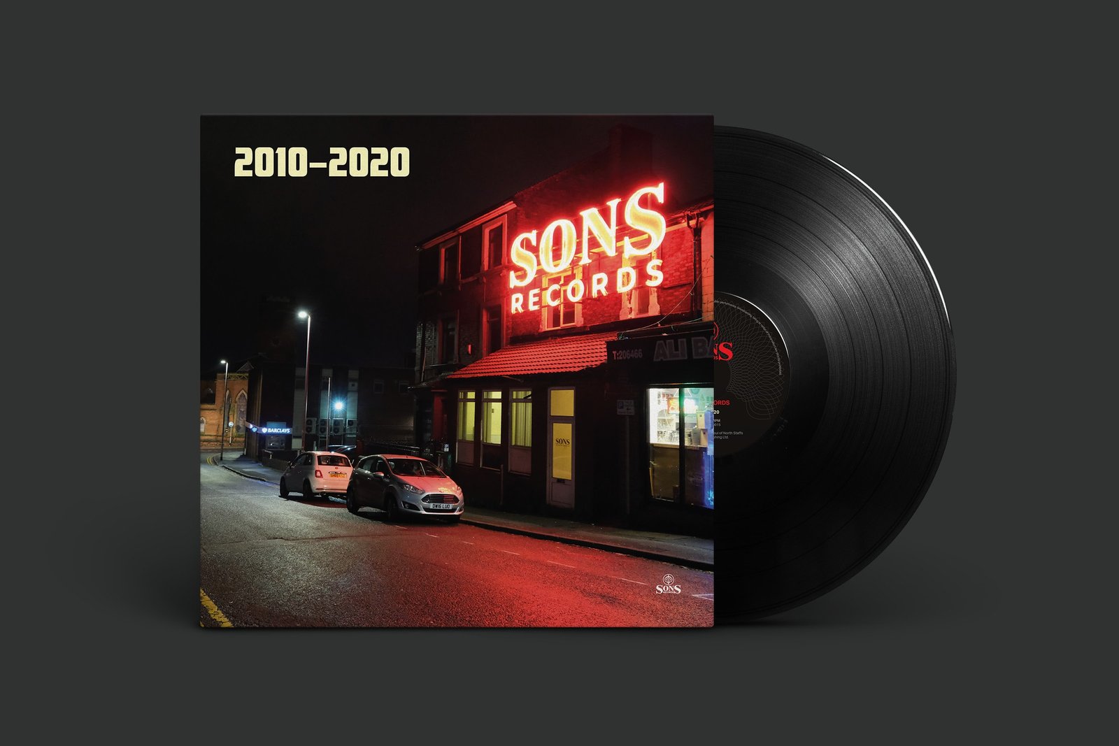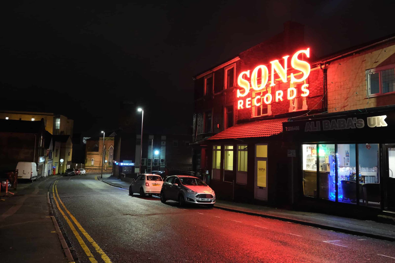
I started the process of adapting the logo by removing the logomark, leaving just the name of the label. I then reduced the size of the two ‘S’s in the word SONS, which enabled me to increase the size of the word ‘records’, making it visible from a greater distance. The result was a giant 6 x 2 metre sign that you just can’t miss.


Client feedback
“Once again, Sam demonstrated a perfect understanding of what we were trying to achieve artistically. Over the years, he’s helped us to create a trademark style for SONS and I would thoroughly recommend him to anyone who places any value on the graphic representation of their brand.”
Seb Clarke
Director, SONS Records
