Strategy
I started the process by working through some brand strategy exercises to help define the brand’s purpose, vision, values, target audience, positioning, and persona. By doing this, I had a much clearer vision of the brand I wanted to build, which would help to guide my decision-making throughout the project and beyond.
Naming
Whilst researching the project, I found that several competitor brand names featured words like ‘Design’, ‘Creative’ or ‘Graphics’. With this in mind, I made a conscious effort to avoid these words and focused on coming up with something more evocative that would help to distinguish the brand.
After a number of brainstorming sessions, I was reminded of the phrase “studio rat”. It’s most commonly used in the music industry to describe someone who’s honed their skills by spending large amounts of time in the studio, working on and experimenting with music. Given the parallels between music and design, and the fact that I’ve developed my own skillset in such a similar way, it felt like I was onto something.
Looking back at my strategy document, I’d identified my skillset and approach to work as being a competitive advantage for the brand. Curious, creative and knowledgeable are keywords that featured regularly, further suggesting that the name was a good fit. After confirming that nobody else in the field was using the name and that a suitable domain was available, the name was decided and StudioRat was born.
Logo
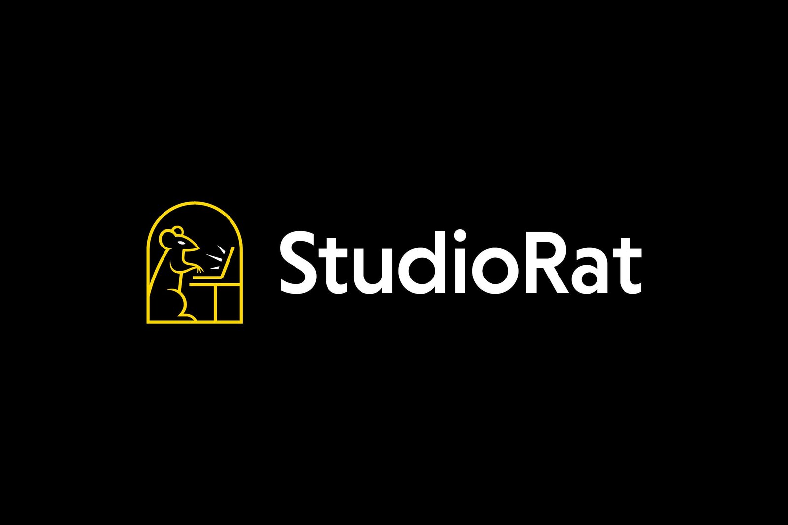
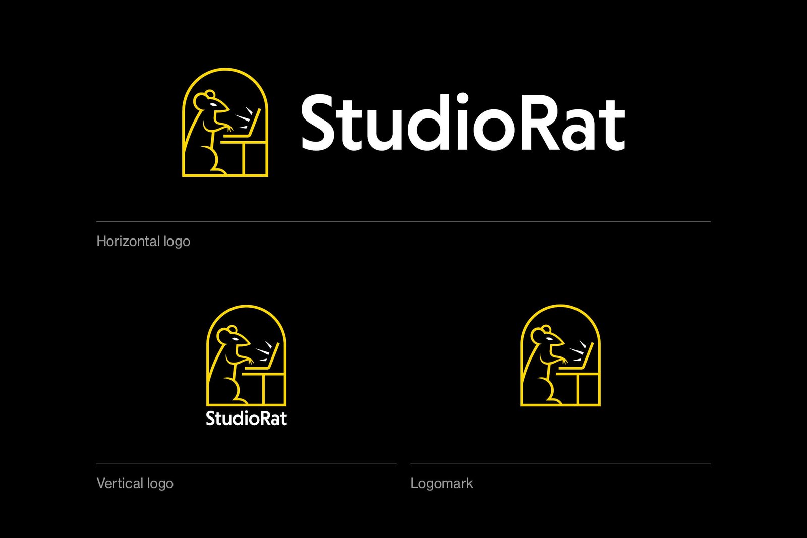
With a name like StudioRat, the logo had to somehow incorporate a rat. The challenge was to create a mark that also tied in with the themes of creativity and/or productivity. I explored a number of ideas, trying to combine the shape of a rat with symbols that represent these themes.
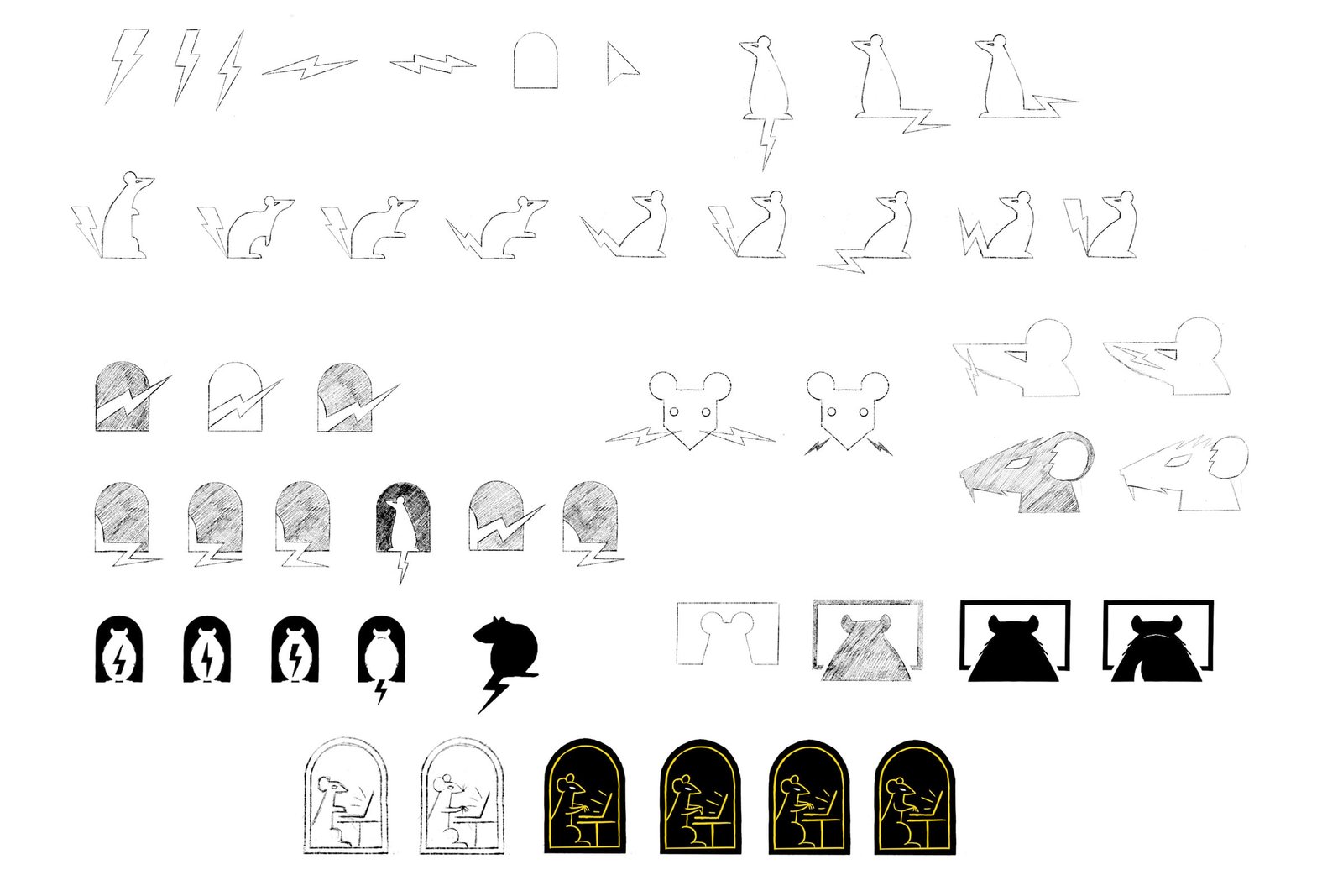
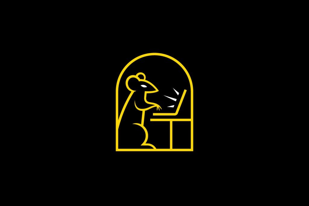
Eventually I arrived at the idea that would become the final logomark. The concept itself is quite literal, but it has a playful charm to it that aligns nicely with the brand’s friendly persona.
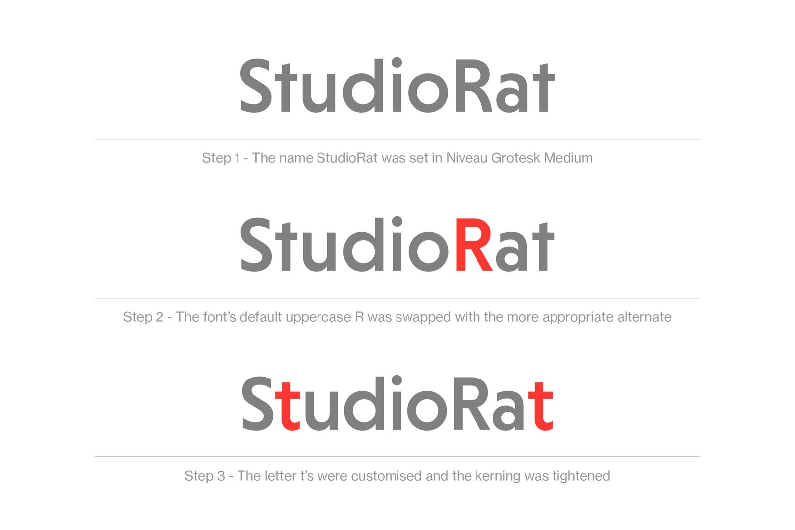
I then paired the mark with a logotype created using a custom version of Niveau Grotesk. I edited the t’s to make the design feel more friendly and the letters more consistent with the shape of the mark.
Visual language
The brand’s visual language needed to reflect the attributes of curious, creative and knowledgeable and be designed in a way that would help the brand stand out from its competitors.
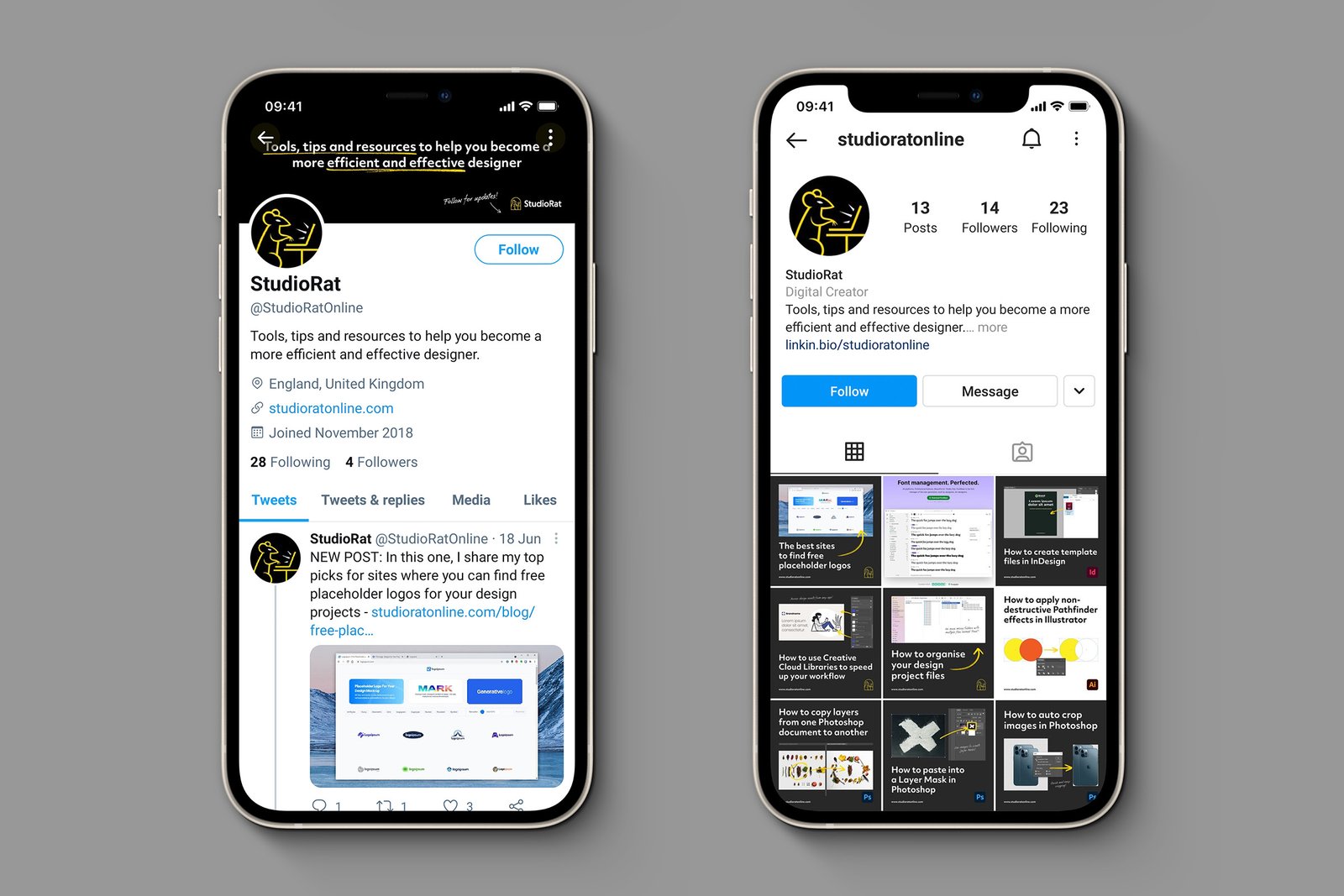
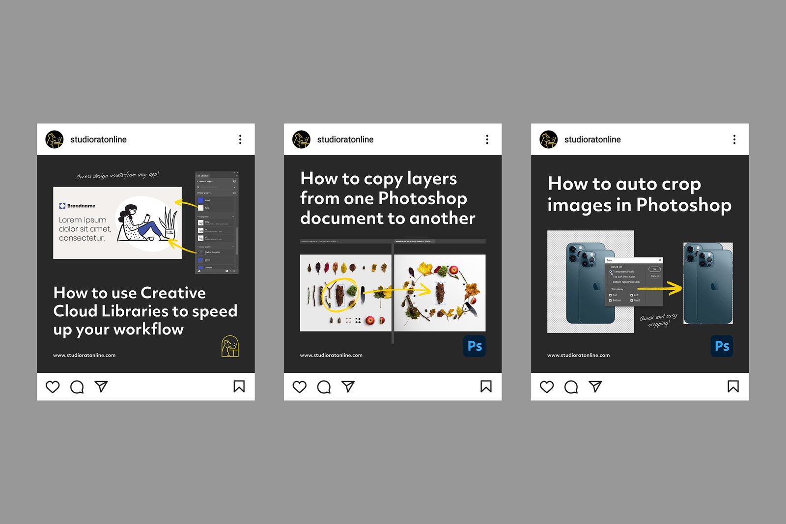
I was able to achieve this by creating a distinct colour palette and using hand-drawn elements to evoke the feeling of creativity.
Colours
Black, yellow and white were chosen as the primary colours firstly because they suit the brand so well and secondly because they help to differentiate StudioRat from other brands in the space, who mostly use blue, red or orange accent colours.

Typography
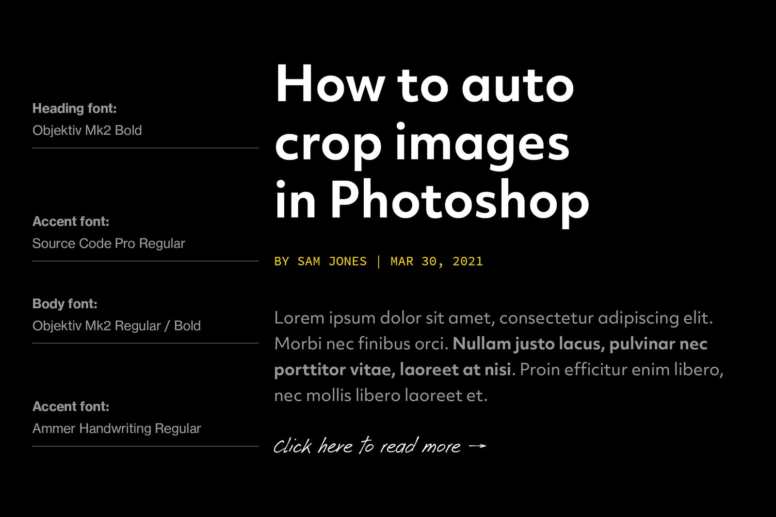
The brand’s primary typeface is a sans-serif called Objektiv Mk2. It was chosen for its mix of character and practicality. Its character makes it ideal for headlines, as it’s more recognisable than the average sans-serif. It’s also very easy to read, which makes it a good choice for body copy too.
In addition to this, I make use of two accent fonts. The first is called Source Code Pro, which is a font designed for use in coding software and is used as a subtle nod to the more technical side of creativity. The second is called Ammer Handwriting, which is used to make supporting text appear handwritten, further evoking the feeling of creativity and adding an extra layer of character.
Website
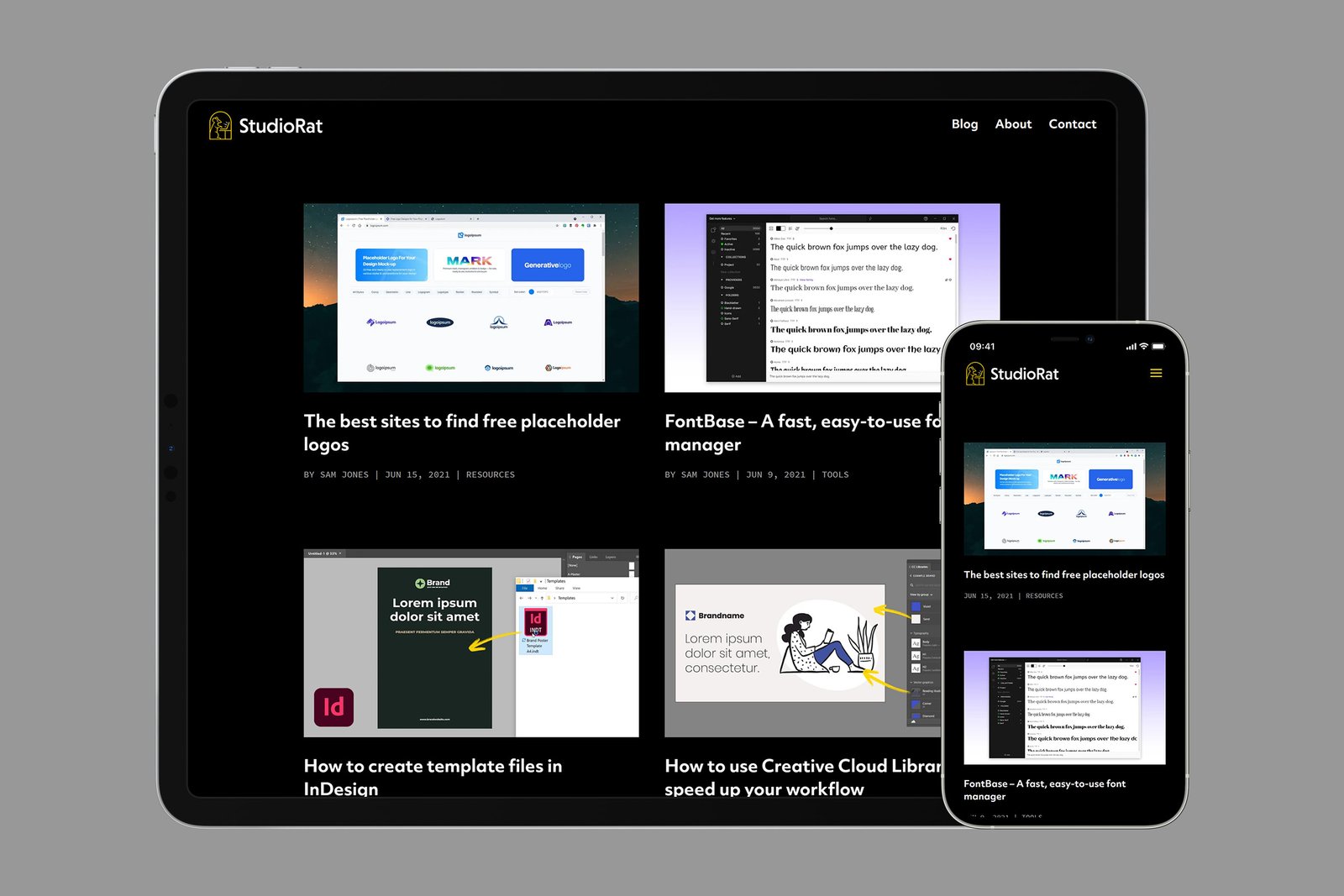
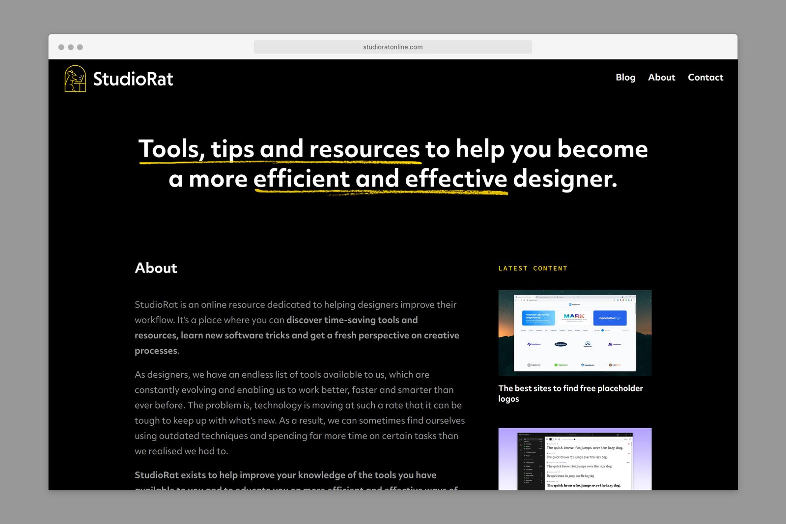
The priority for version one of the StudioRat website was to create a blog, which would be used to help the brand create content and build an audience. I chose to create the site using WordPress, which has a content management system ideal for running a blog and offers plenty of room for expansion later on.
The site features a responsive, mobile-friendly layout and the design is consistent with the brand’s visual language. It features a dark background with splashes of yellow used to help elements grab users’ attention.
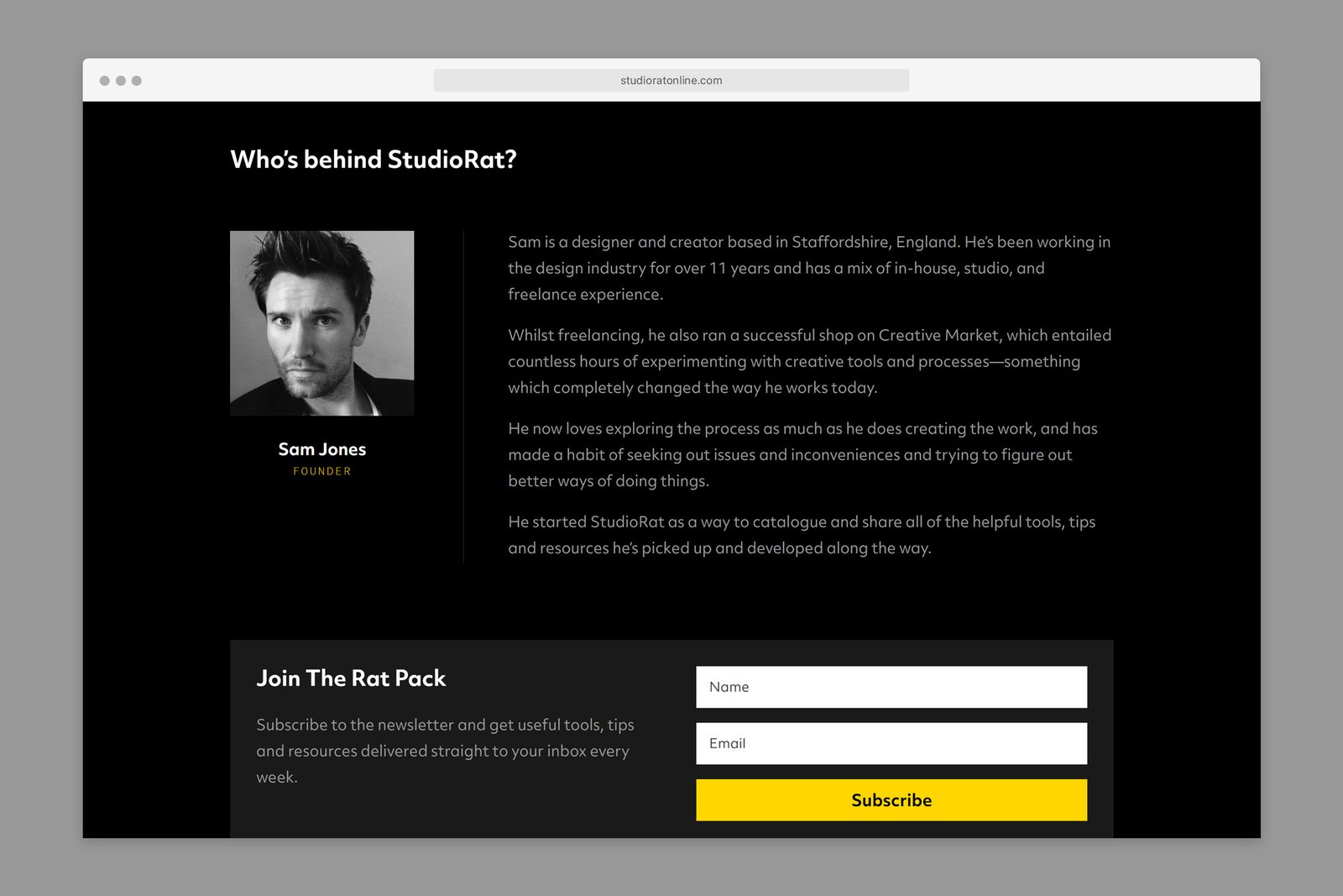
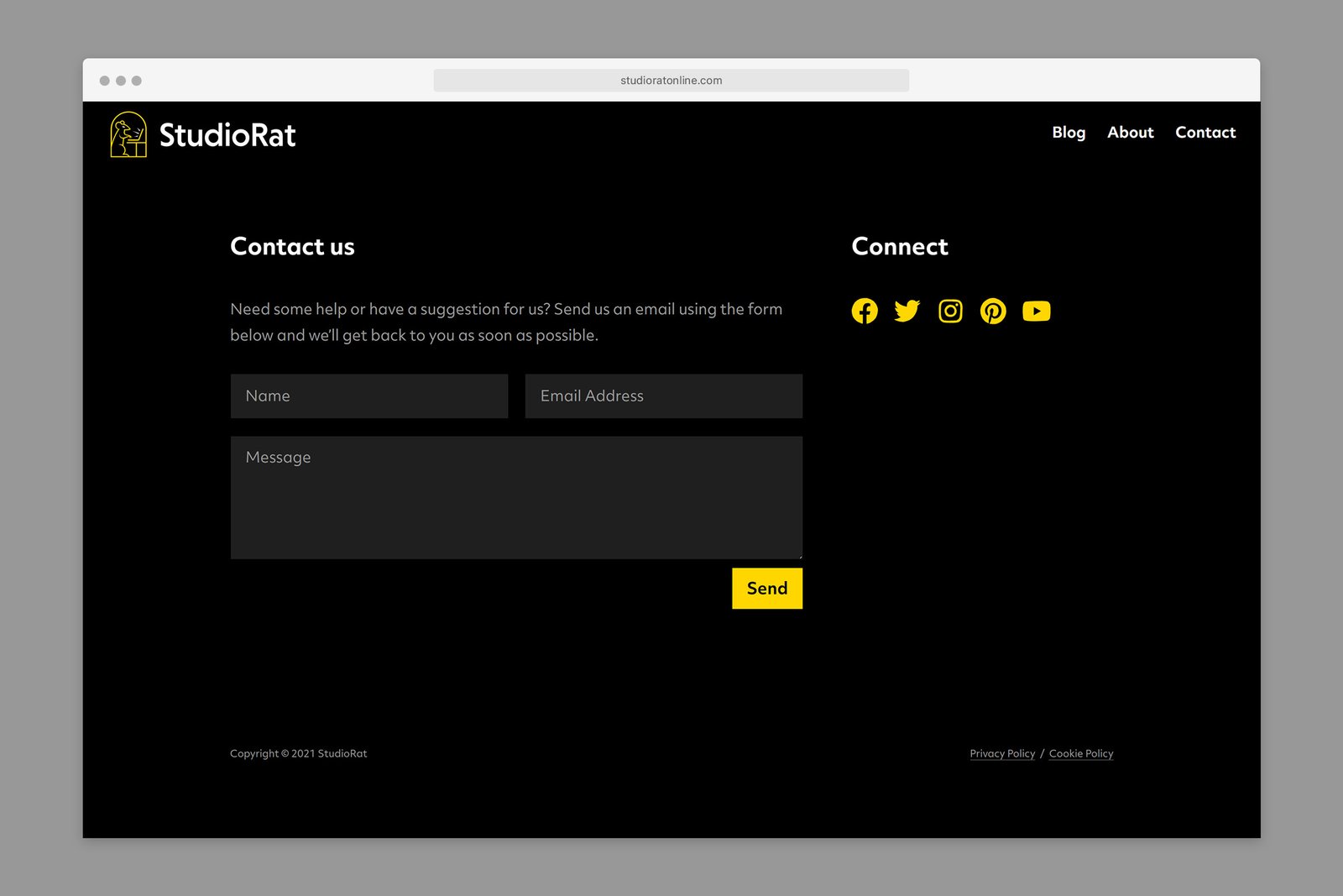
Although a light-on-dark theme works well for pages with small amounts of text, research suggests that it can make longer chunks of text harder to read. Knowing this, I designed blog post pages with a dark-on-light theme to make the content easier to consume.
To see more, visit the StudioRat website.
